
Mozilla’s Firefox allows installing of developer tools to extend Firefox functionality and is also useful to develop Plug-ins or Add-ons. One of the developer tools is “Responsive Design View” which is useful to provide a presentation that is suitable for different kinds of devices; such as mobile phones or tablets. To test this feature, first, we need to enable it.
Step (1). Click on the Firefox icon; which is on the top-left corner of the Firefox window. Firefox will display a pull-down menu.

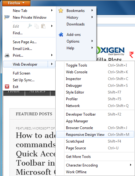
Step (2). Select “Web Developer” from the pull-down menu. It will display a sub-menu.
Step (3). From the sub-menu, select the “Responsive Design View” menu item. FireFox will open the website into a responsive design view.

You can also enable “Responsive Design View” by clicking on the “Ctrl + Shift + M” keys from the keyboard.
Step (4). In responsive design view, we can check the website’s look and feel that is suitable for different kinds of devices, such as mobile phones or tablets.
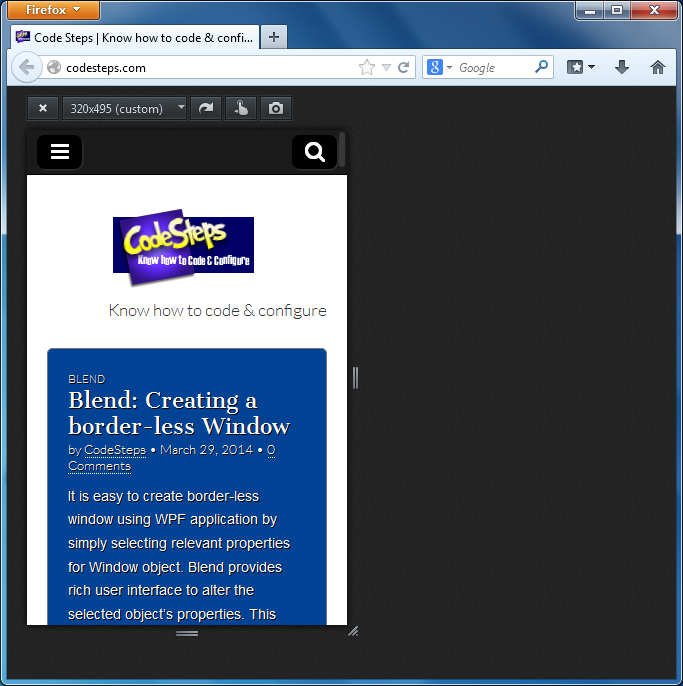
- We can use responsive design view controls to adjust the width and height of the content area. Select the size from the combo box. The above screenshot displays the codesteps.com website in 320×495 dimensions.
- Click on Rotate icon which is next to the size combo box is to rotate the content area.
- Simulate touch events icon is useful to enable or disable touch event simulation. If it is enabled, mouse events will behave like touch events.
- Use the Screenshot icon to take the screenshot of the content area. It will automatically be saved into the disk.
- You can also re-size the content area by dragging the re-size controls which are on the edges of the content area.
Once you are done with the responsive design view, click on the Close button in the content area, to close the responsive design view and the website will display in normal view.