
One of the most used control in Windows Forms is the Button control. We use Button controls, to take ‘click’ input from the User. The best example where we use Button controls is, prompt the user for an operation to perform by providing Yes or No buttons. Depending on the user input, a particular operation will continue to execute.
Button class is an associated C# class for Button control. Before we use Button control, we need to place the Button control on the Form, from where we want to use this control. We can also create Button controls dynamically on the Forms.
Properties of Button control
There are so many properties this control has. We will discuss a few of them and commonly used properties, through this article.
The text entered in the Text property will be displayed on the Button control.
It has Visible property; if it sets to True, the control will be visible; otherwise, it will not visible on the Form.
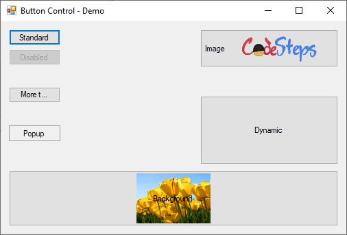
We can set the style of the Button control by setting it’s FlatStyle property; through this we can set Flat, Popup, Standard, and System styles. For example, the below screenshot displays Standard & Popup buttons.
Enabling or disabling the button control can be done through its Enabled property. Disabled controls do not trigger Events and also do not receive the keyboard focus on it. From below, the Disabled button is an example.
We can also place images on the Button control, by setting its Image property. This will give more look and feel, instead of giving only text to the control. Image or Icon will give more meaning to the control. Another important property we need to set when we set image, is TextImageRelation property. This tells where to place the image, relative to the text on the Button control. The below screenshot shows the Button, with both text and image displayed; and with this property set to “TextBeforeImage” value.
BackgroundImage property allows setting the background. Note that, this property and Image property are different. This property sets the background picture of the control; whereas, Image property displays the image on the control (foreground). You can control the way the image displays, by using BackgroundImageLayout property. It allows Tile, Center, Stretch, and Zoom values. Last Button in the below image sets with the background image.
We can also create the Button controls on the Form, dynamically. The “Dynamic” button, from below, is an example of it. Maybe, we will discuss this in a separate article.
Observe the appearance of the Buttons, when respective properties are set, from the below image;

Button control Events
Button controls can accept, Events. One of the most used events is Click event. Once we click on the button control, the Click event will trigger and the associated event handler will execute.
Another commonly used events for this control are Enter and Leave events. These will trigger when the control becomes an active and in-active state, respectively. When the control is active means, the keyboard’s focus is on the control and is ready to accept the input from the user.
If you enjoy reading this article, please give feedback in below comments section.
We will discuss more, through upcoming Articles.
(Raju)
2 thoughts on “C# – How to use Button control?”